Here at Garden Party Flowers, we always strive to try new things. At our shop the goal is to be ahead of the trends! While the style of our arrangements or bouquets are very bold, one of the things I realized is that sometimes our colour choices can be a bit, well, predictable. When dealing with flowers you are provided with many different hues, both bright and soft. As an art student I learned that colour is very important. Colour can set a mood or make a statement. Colour preference is often the very first question I ask a customer who is ordering flowers for someone they care about. For example, when a customer requests a graduation or birthday bouquet I tend to suggest bright colours like fuchsia, yellow, orange or red. These colours tend to be happy and loud, and will make a unforgettable statement when they are delivered to the recipient. When dealing with sympathy arrangements, most clients want the flowers to be comforting and elegant. I tend to suggest whites and greens, or perhaps a nice deep burgundy. These flowers will not overwhelm the recipient who is grieving the loss of a loved one.
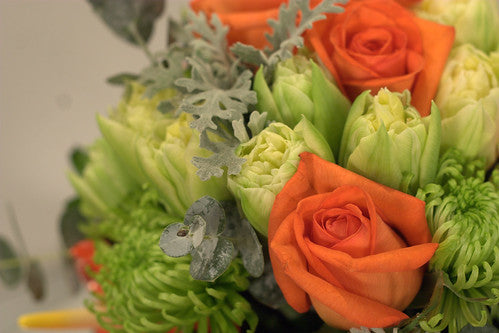
While all of these general rules are good, it left me wanting to experiment with more than the typical colour combinations. In our shop, the most freedom in design comes when we create our weekly corporates. We must ensure to be giving our clients something different each week, and that can be a bit of challenge! Our corporate clients require flowers that are often needed to bring life into their office space. I started one week with the colours orange, cream and grey. I chose bright orange roses, cream tulips and paired them with some dusty miller and eucalyptus. The result was wonderful! They grey and cream were very sophisticated and really enhanced the orange roses to make them look brighter than they actually were. So began my experimentation with colours…

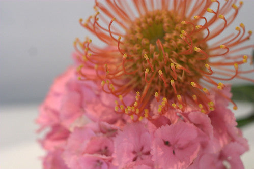
When choosing your own colours, there are many choices. I try to encourage customers to think outside of the box. While experimenting with colour there are a few important things to keep in mind. If you choose flowers of many different colours, you want to stick within a similar tone. For example, when choosing pink, yellow and orange, you would want all of these colours to be bright and intense, or all soft and cool. Mixing bright and soft tones of different colours may look a bit strange. When creating a monotone bouquet, different tones are actually good! It gives an arrangement more depth, as bright tones tend to jump out while softer colours sink down. This little trick will keep your eye moving around the arrangement, so you notice each individual flower. Also, keeping things simple is always a good rule to follow. You do not want to mix too many different colours in one arrangement or bouquet. Too many colours will make a bouquet or arrangement look very busy and confusing to the eye. When creating a bouquet try to stick to three colours at the most, but you can do more if some of the colours are very similar. For example, a coral, peach, yellow, orange and blue bouquet will still look lovely because the coral, yellow and peach are very similar. The small touch of blue will also really enahnce the other colours in the bouquet. I also really enjoy the purple and yellow combination for spring. On the colour wheel purple and yellow are opposite each other, which means they are complimentary colours. Complimentary colours naturally enhance each other, so the purple will seem more purple, and the yellow will also appear more intense! I found purple and yellow growing along side each other in many flower beds and thought it made quite an impact! Other complimentary colours include green and red, and also orange and blue. I have a colour wheel at the shop to help me see what colours will look nice together.

Colour means a lot when it comes to floral design. The colours you choose for your bouquet or arrangement can help to make the statement you want to make with your flowers. Certain colours will have different meanings to different people, and it is important to take this in to consideration as well. What ever colours you choose, take a moment to really think about what colour means to you and the recipient of the flowers! What ever you choose, have fun and be bold!
More interesting combinations to choose from:
deep purple and red

blue and yellow

yellow and purple

orange and pink
orange, white and grey